Lauren Smith AS- School Magazine
Monday, 2 December 2013
Thursday, 7 November 2013
Monday, 4 November 2013
Front cover photographs
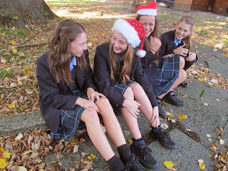
I have taken several different photographs that will be used as my front cover and contents page of my magazine.What photography I chose will depend on which of the particular pictures suits the theme of the magazine which is Christmas and also ties in with the font and colour scheme I have chosen to use for my School magazine.
Locations
 |
| Front Of The School |
Monday, 21 October 2013
Colours
 |
| Colour Wheel |
When
I was considering the theme of the school magazine I thought about the colour
scheme and its significance it has on the reader. For my school magazine, the
theme I have chosen is Christmas. Therefore I need to choose suitable colour
that links and associate with the theme Christmas. The four main colours are
usually white, gold, red and green.
Red-
This colour represents happiness, passion and
enthusiasm. This links in with the theme of Christmas as it’s a time of joy and
happiness. Red in the holly berries represents the blood of Jesus when he died
on the cross.
White-
This is a neutral colour with this it
represents purity. It also links to the winter weather of snow and the coldness
of the winter which is when Christmas time falls.
Gold
– This colour
represents life and the sparkle of
the Christmas holiday celebrating the new beginnings. Gold is a warm colour and
represents the star the wise men followed.
Green- This colour represents eternal life
and the association of nature. The hollies was used the brighten up the dark
winter days with the symbol of hope for new beginnings.
When choosing my colour scheme I had to
insure they were appropriate for both genders. For instance using pink, bright
feminism colours would appeal to boys. My theme of Christmas is targeted to aim
at both boys and girls. This is why I felt that the Christmas theme is
expectable and it was mixed colours of red, gold and white with attracts to
both genders as they are the traditional Christmas colour schemes. When the
students completed my questionnaire I found that Christmas Appeals to both
genders.
Front cover fonts
There is a
wide variety of fonts available for me to use as my masthead, but I have to
take in to consideration which will most be suitable for my Magazine as I have
chosen the theme of Christmas therefore I feel it is important to link all my
aspects of my magazine to my chosen theme. My font needs to look professional
and realistic. I also need to chose my font carefully as it can affect what
informal/ formal to magazine appears to the reader.
Showcard Gothic
I felt that the “Showcard Gothic” font was to
over powering for the magazine masthead. The font bold and strong no in keeping
with the theme “Christmas” which a holiday which is usually associated with he
emotions of joyfulness.
Lucdia Handwriting
This Font is very elegant and professional and
I felt that it was too formal for the specific target audience. The font is
very soft and gentle and I would have liked my masthead to being slightly
bolder and friendly that it was engage the audiences and link to the Magazines
main theme.
Subscribe to:
Comments (Atom)


